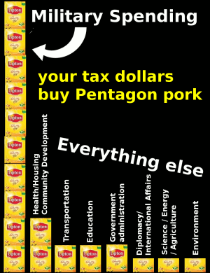
Graphic design is not my strong suit, but for Northern California War Tax Resistance’s actions I’ve been tasked with coming up with some sort of sign that uses a bar chart to illustrate the U.S. federal government’s discretionary spending priorities based on Barry Hermanson’s numbers
Well, I’ve sketched out an idea. It’s not much to look at, but here ’tis:

As you can see, I’ve integrated tea bags into the design as a way of tapping in to the latest trend in Tax Day protesting and in hopes of catching the eye of those protesters who are outraged at government spending but aren’t clear on just why that spending is so darned high.
I dunno. What do you think? It strikes me as a little cluttered and confusing, while at the same time being a little too oversimplified (for instance, the graphic doesn’t indicate that it’s talking about discretionary spending rather than all government spending). I’m not crazy about the “your tax dollars…” tag line either. Any ideas?
